![FlyFreely_Logo_White_OnDark.png]](https://knowledge.flyfreely.io/hs-fs/hubfs/FlyFreely_Logo_White_OnDark.png?height=40&name=FlyFreely_Logo_White_OnDark.png)
In FlyFreely, forms are combined in sequence to build workflows, which dictate the steps required to plan and execute a mission in the platform. They are used to create items like checklists, job sheets, safety assessments etc.
The office app has a built-in form builder which allows you to create new forms, or edit default or existing forms to meet your operational requirements.
This article will walk through the form creation and editing process, and explain how to combine the various control types into forms to support your operations.
Sections (click to skip to specific topics)
What is a form?
In FlyFreely, a form is simply a document into which the end user (for example, a remote pilot) can enter specified information. The most common use of forms are risk assessments and pre-flight checklists, in which a series of checks (controls) are presented to the user to help guide their mission preparation and execution.
Forms are highly configurable, and can be created and edited by organization administrators.
Forms and workflows
It is important to note that collections of forms are combined into workflows. A workflow can include as many forms as required for your operations. This means that your individual forms can be as broad or as specific as you like - for example, instead of having a single large "Pre Mission" checklist, you can create individual checklists for Safety assessment, Crew briefing, and Equipment setup to break the process up into more manageable tasks. You can then load all three forms into the 'Pre mission' section of your workflow, to be completed in succession by the remote pilot in the field.
For more information on workflows, please visit our article.
Creating a new form
To create a new form from scratch, navigate to Organisation Admin > Documentation Templates and press the + button.

This will open the form builder. This screen contains the following fields:
- Name (required) - we recommend developing a consistent naming convention across your forms, for example: [Company Name] - [Form Type] - [Details].
FlyFreely - Pre Flight - Matrice 210 RTK - Form Description (optional)
- Version - When building a new form from scratch, use 'New Version'. This will change to 'Version 1' when you save your form.
There are also a number of buttons/controls:
- Arrange Sections - allows you to re-order sections of your form (more on this later)
- Import Form - Import a previously exported FlyFreely form (useful for copying forms to a different organisation)
- Export Form - Downloads your form in .JSON format. This can be re-imported into FlyFreely (see above)
- Preview Form - Opens a preview of your current form with functioning controls. Useful for previewing changes and control behavior.
- Add Form Section - Adds a new section, to which various controls can be added. Sections function as 'dividers' in your forms to enhance legibility and break up sub-topics within the form.
Sections
Sections are a useful tool that help to break up controls into related topics. For example in a Pre-flight checklist you might group checklist items into 'RPA checks', 'System checks', 'Area checks' etc.
Using sections also increases legibility in longer checklists.
Sections can be re-ordered using the 'Arrange Section' button at the top of the form builder.
Note that individual controls cannot be moved between sections. If a control is added to the wrong section, you can either delete the field and create it again in the correct section, or clone the section containing the control and delete any other fields from the cloned section.
If your form won't save, check to make sure that you don't have any 'blank' or empty sections, as these are often the cause of saving errors.
Controls
Controls are the individual 'fields' that make up the form, and can be divided into sections. The form builder includes many types of controls to allow maximum flexibility in your forms and checklists.
We recommend familiarizing yourself with the various controls by first opening the 'FlyFreely Demo Form' located in the documentation templates section. You can also download the .JSON file and import it via the form builder. Use the preview function to see how each type behaves, and edit the controls to observe the effect your changes make.
Control Types
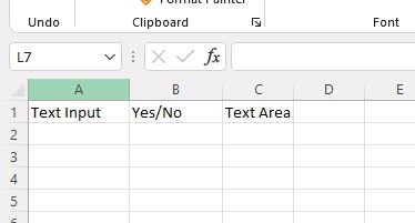
| Text input | Allows single line text entry. |
| Number input | Allows for entry of numbers only. |
| Number range input | A slider which allows numerical input between defined values. |
| Text area | Allows entry of longer text entries. Field will expand as text is added. |
| Yes/No | Yes/No input is great for checklist responses. |
| Check | A simple checkbox. Note that if set as 'required', the end user MUST check the box in order to proceed. |
| Single dropdown selection | User can select one option from a dropdown menu. The 'group' field allows options to be grouped if required, otherwise leave blank |
| Informational message | Displays a message with blue background |
| Warning message | Displays a message with orange background |
| Warning message with acknowledgement | Warning requiring user acknowledgement to proceed |
| Image | An imported image displayed |
| Calculated | Outputs the sum of two or more controls with numerical values |
Many of these types are straightforward to use. The following section will examine the functionality of the advanced control types - Single dropdown, image and calculated.
Single Dropdown Selection
This type displays a dropdown menu from which the user can select one option.
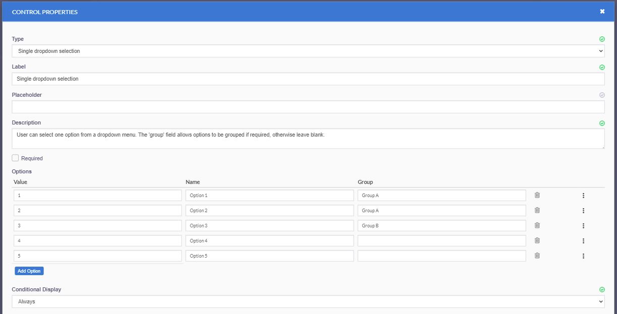
As with all controls, the label field is mandatory. This is the displayed name for the control. All other control fields are optional.
In this example, we've added 5 options to the menu. Each option has 3 fields. The required fields are
- Value - This is a numerical value given to each option. If no specific value is required you can enter 1, 2, 3 etc as in the above example, but the value can be anything.
- Name - This is the name of the option displayed in the dropdown menu.
In addition, you can choose to group your options (similar to sub-headings within the dropdown list). In our example we've added two options into 'Group A' and one into 'Group B' but the groups can be called anything you like. We've left the last two options without a group to show that this field is optional.
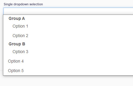
The output of the above dropdown selection looks like this:
Having a numerical value allows this control type to be used in conjunction with the 'Calculated' control - more on that later.
Image
The image field allows the display of an uploaded image within the form/checklist. This is commonly used in risk assessments to display the 'risk matrix' but can also be used to illustrate matters relating to RPA assembly, app configuration etc.
This field is fairly basic, but in practice administrators often get stuck, not realizing that adding the control is a 2 step process. In order to add an image to your form, follow these steps:
- Upload the required image into the Form gallery
- Add the Image control to the form and select the image from within the gallery
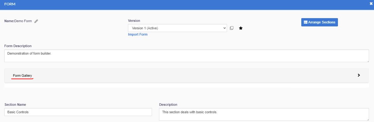
The gallery appears near the top of the form builder screen only after the form has been saved at least once - simply click the Save button to make it appear. Clicking on the form gallery brings up an upload button - simply drag your image onto this button or click it to browse to the file.
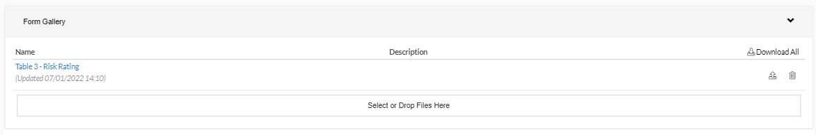
Once your file appear in the gallery, it is available to be used in an 'image' control anywhere in that form.
Once uploaded into a form, images cannot be resized or edited in any way. We recommend resizing your images to <1000px width prior to upload.
Calculated
This control doesn't contain any information of it's own, but simply adds the numerical values of two or more controls. This control is especially useful for calculating overall risk ratings, where the planner inputs likelihood and consequence values for a given risk.
The control types that contain numerical values are:
- Number input
- Number range input
- Single dropdown selection
To calculate a value based on two or more of these fields, add the Calculated control to your form.

After labelling your control, select Sum from the 'Calculation' dropdown (other functions may be available in the future). Click the + button to add the first numerical field.
Any available numerical fields will be displayed in the menu.
It is recommended that any fields to be included in your calculation are set as 'required', to ensure they are populated by the end user. If a value is not entered for one of your values, it will be regarded as a '0' by the calculated field, which may result in an incorrect calculated value.
Select any remaining fields to be included in the calculation and click Update. Check that the calculation is working correctly via the form preview function.
Conditional Controls
These are controls which are only displayed based on the status of another control in the form. If the required condition is not met, a conditional control won't be displayed.
Conditional controls can set to appear based on the following control types:
- Number input
- Number range input
- Yes/No
- Check
- Warning with acknowledgement
- Calculated
Any control can be made conditional, but it can only be conditional based on the value of one the above types.
In order to make a control conditional, select 'conditionally' from the dropdown menu within that control.
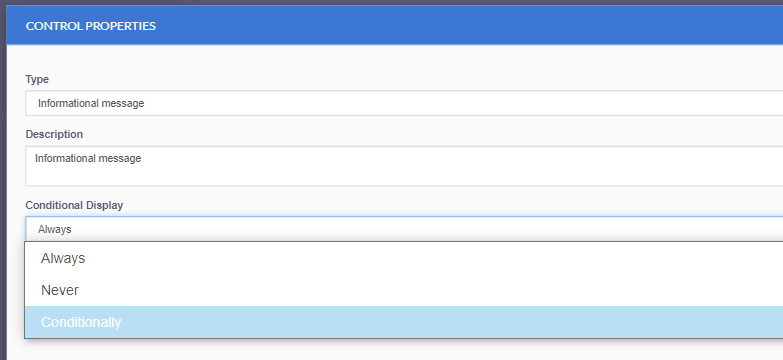
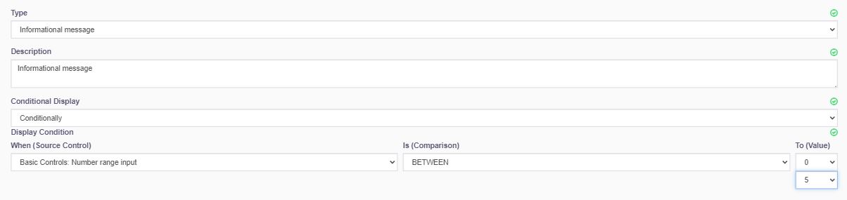
This will display 3 fields, all of which are required.
- The source control field will display any available fields to be used
- The comparison field shows the available operators
- The format of the value field is based on other two fields (a single input or multiple inputs in the case of the 'between' and 'not between' operators.
For example, the following example will display the informational message only if the value of the "Number range input" field is between 0 and 5.
For Yes/No, Check and Warning with acknowledgement control types, you must enter either a 0 or 1, as shown below.
| Value | Yes/No | Check | Acknowledgement |
| 0 | No | Unchecked | Not acknowledged |
| 1 | Yes | Checked | Acknowledged |
Repeating Elements
In most cases (eg checklists) your forms will have a relatively simple structure, usually a list of controls which the user must fill out to complete the form. Each control appears once in the form.
There are however some cases where you need the user to add items to the form in a pre-defined format. A great example of this is Risk assessments, where the mission planner must add risk item/s and then complete standard fields relating to that item (consequence and likelihood values, risk mitigations etc).
To allow for this, the form builder includes the option to create repeating elements. This is set on a per-section bases, so you can integrate these elements with other linear controls in your form.
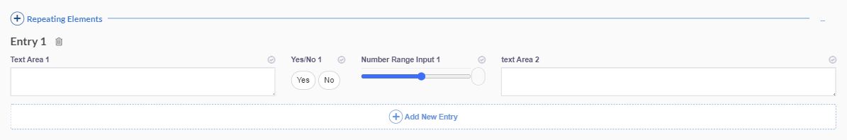
To create a section of repeating elements, simply add a new section and tick the 'repeating elements' box:

Next, add the controls that you wish to appear to the user. Looking again at the demo form, you can see the output preview below:

The user will add items to the form by pressing the + button and filling out these fields.
Layout Options
When using the repeating elements feature, there are two layout options available. The example above uses the table layout. This option divides the available screen area into equal columns, and adds column headers.
The other option is the 12 Column layout. In this case, the form section is divided into 12 columns, and you can set the width for each column in the form builder. Using the above example, we might choose to reduce the width of the slider and Yes/No columns in order to make more room for the text inputs:

Note the addition of the 'Column Span' field when editing the 12 column view. Using the above spans gives us the following result:
You can use all control types within the repeating elements framework, however due to the fact that these controls are generated 'on the fly' by the user, condition and calculated fields will only work with controls on the same line.
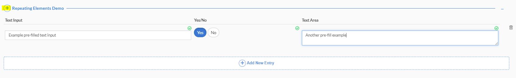
Pre-Fill
To save time during mission planning, it's possible to have your repeating elements pre-filled by default. This feature is frequently used in risk assessments, where you might have a standard library of risk items, from which the mission planned can subtract non-applicable items.
Pre-filled items can be populated manually, or by uploading a correctly-formatted CSV file.
Add Pre-Fill Manually:
To pre-fill your repeating elements manually, select edit pre-fill:

Click the + button to add a new element, and fill out the controls/fields with your required pre-fill. You can add as many new elements as required.
When you're finished, simply click complete. You can go back and edit your pre-fill at any time.
Add Pre-Fill via CSV file
For users with larger risk libraries or other large amounts of pre-fill to import, using the CSV upload is a more efficient way to go.
Click 'edit pre fill' as shown above, then click the ... button in the top-right of the panel.

Select download template to download a blank CSV file with the appropriate column headers. In our simple example, the file looks like this:
For subsequent revisions, select 'Download CSV' instead, as this will download the CSV with any existing items included. You can then edit these items and add items in the CSV file and reupload it.
Next, copy your pre-filled text and other responses from your existing library to populate the CSV template. Once your template is complete, save the file and select upload CSV from the ... menu in the form editor. Your repeating elements will now be populated. Click complete to save your changes.
Editing Existing Forms
Like workflows, forms are 'version controlled' in that once a form has been attached to a mission record, it can't be edited directly.
In order to make changes to a form which has been used, you must first create a new version of the form. In most cases, this is done by the 'Clone this version' button to the right of the version dropdown menu. This will create a new version of the form with all existing sections and controls intact, which you can then edit.

On saving your changes, the new version will be given a number, but won't be made active automatically. In order to make your new version active, press the star button next to the 'clone version' icon. This will set the new version to be used in all subsequent mission planning.
There are many standard 'global' forms in FlyFreely which can either be used 'as is', or as a starting point for your own forms. Once you save a new version of these forms, the newly created version automatically becomes specific to your organization and won't be visible to others.
Conclusion
The correct configuration of forms is central to creating useful, efficient workflows. Depending on your organizational requirements, this could be relatively straightforward or quite complex. In most cases however, forms will largely be 'set and forget' once configured. If you have any questions about forms, please contact support.